

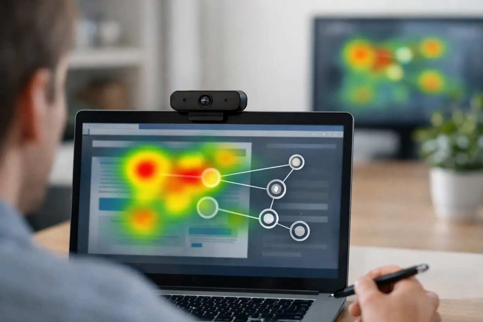
A heatmap can make attention look obvious: red areas were seen, cool areas were not. But a heatmap interpretation guide should start with a harder truth. Color alone does not explain why people looked, what they understood, or whether the attention helped your business objective.
For UX teams, media researchers, and creative decision-makers, the value comes from connecting visual attention to a specific research question. Did shoppers notice the price? Did visitors see the primary call to action before abandoning a page? Did the brand appear in an ad early enough to be remembered? Heatmaps help answer those questions when they are read alongside the study design, participant behavior, and supporting metrics.
What a heatmap actually shows
An eye-tracking heatmap is an aggregated visualization of where participants looked on a stimulus. Areas with more or longer visual attention are typically shown in warmer colors, while areas with little or no recorded attention appear cooler or remain uncolored.
That aggregation is useful because it reveals patterns that are difficult to spot in individual recordings. A product image may attract attention immediately while the offer beside it is overlooked. A navigation label may pull attention away from the intended task path. On packaging, a claim may be technically visible but receive too little attention to influence a purchase decision.
Still, a heatmap is not a measure of preference, comprehension, persuasion, or conversion by itself. People may look at an element because it is useful, confusing, visually dominant, surprising, or simply placed where their eyes naturally land. Treat it as evidence of attention, then test what that attention means.
Start with the decision, not the colors
Before opening the analysis dashboard, define the decision the research needs to support. This prevents teams from treating the brightest spot as the most meaningful finding.
For a landing page, the question might be whether users find the value proposition and primary action without unnecessary detours. For an ad, it may be whether the audience sees the brand and key message within the first few seconds. For a shelf test, the focus could be whether the package is noticed against competitors and whether mandatory information is visible.
The same heatmap can lead to very different conclusions depending on that goal. Heavy attention on a help icon may be positive in a support flow but concerning in a checkout flow, where it can signal friction. Attention on fine print may matter for regulatory communication, yet it may not be relevant when evaluating the impact of a hero image.
Write down the success criteria before reviewing the visual output. That simple step gives the analysis a standard for judging whether attention was productive, delayed, misplaced, or absent.
Read heatmaps in the right order
A practical heatmap interpretation guide does not begin by zooming into every red area. Start broad, then narrow the analysis with purpose.
Check the stimulus and study conditions
First, confirm that participants saw the same content you intend to evaluate. Responsive websites, device differences, dynamic elements, cookie banners, loading states, and scrolling can all change what appears on screen. If a key element was below the fold or obscured for part of the session, a weak heatmap result may reflect exposure rather than lack of interest.
Also review the task. Open exploration produces different viewing behavior than a directed instruction such as "find delivery information" or "choose a product." Neither approach is inherently better. They answer different questions. A task-based study is useful for usability and findability, while natural viewing can better reflect first impressions or advertising exposure.
Look for attention distribution
Next, assess how attention is distributed across the page, creative, video frame, or image. Is attention concentrated around the intended priority area, or scattered across competing visual elements?
Concentration is not always a positive signal. A dominant image can create a bright hotspot while the message, price, and action receive little attention. In that case, the creative may be visually engaging but commercially inefficient. Conversely, a more balanced pattern can be appropriate when users need to compare features, read instructions, or evaluate several products.
Ask whether the distribution matches the visual hierarchy you intended to create. If the answer is no, identify the competing elements: large photography, high-contrast colors, faces, animation, navigation, badges, or unexpected text blocks often redirect attention.
Compare intended and actual paths
A heatmap shows accumulated attention, not sequence. To understand whether viewers encountered information in the right order, pair it with fixation plots, gaze replays, time-to-first-fixation, or area-of-interest metrics.
For example, an ad heatmap may show attention on both the brand logo and the offer. That sounds encouraging until timing reveals that participants looked at the logo only after the ad’s main message had passed. In a short-format placement, late brand attention may reduce recognition even though the logo appears warm on the final aggregate image.
For a website, users may eventually find the call to action, but only after spending time on unrelated navigation items. The heatmap confirms visibility; timing and path data reveal whether the experience was efficient.
Use areas of interest to make findings measurable
Heatmaps are excellent for exploration, but areas of interest, often called AOIs, turn visual observations into comparable measures. Define an AOI around each element that matters to the research objective: a logo, CTA, product, price, navigation label, claim, form field, or competitor package.
Then examine metrics such as time to first fixation, percentage of participants who saw the area, total fixation duration, fixation count, and revisits. These measures provide more defensible answers than a visual impression alone.
Suppose 80% of participants looked at a promotional badge, but the median time to first fixation was eight seconds. That may be acceptable on a detailed product page, where users are expected to browse. It may be a problem on a display ad that appears for only five seconds. Context determines the threshold.
AOIs are also valuable for A/B comparisons. If one design brings earlier attention to the value proposition while maintaining attention on the product and CTA, it has a stronger case than a version that simply produces a more dramatic heatmap. Keep AOI boundaries consistent across variants so the comparison remains fair.
Avoid the most common heatmap mistakes
The first mistake is treating red as success. A warning message, confusing label, or irrelevant image can receive intense attention for the wrong reason. Add survey responses, task completion, click behavior, mouse tracking, or emotion measures when you need to explain the response.
The second is ignoring sample size and participant mix. With a small or highly varied sample, heatmaps can look more decisive than the underlying evidence warrants. Use a sample appropriate for the decision’s risk, and compare relevant segments only when each group has enough participants to support a meaningful pattern.
The third is comparing colors across reports without checking the scale. Some heatmap tools normalize intensity within each stimulus, meaning the reddest area in one design is not automatically receiving more attention than the reddest area in another. Use the same settings, participant criteria, exposure time, and AOI metrics for valid comparisons.
The fourth is overlooking visibility. An element cannot earn attention if it was not on screen. For scrolling pages and interactive prototypes, analyze the relevant screen state or session segment rather than assuming the full-page image reflects everyone’s experience.
Turn patterns into practical design changes
The best outcome of heatmap analysis is a clear next action. If viewers miss the primary CTA, consider placement, contrast, spacing, competing elements, and the clarity of the surrounding message. If a product gets attention but the value proposition does not, test tighter proximity between the image and the claim. If users repeatedly inspect a label or form field, investigate whether the wording creates uncertainty.
Make one change at a time when possible. A redesigned page with a new headline, image, layout, and button color may perform better, but it becomes difficult to know what caused the improvement. Iterative testing makes findings easier to apply across future assets.
Remote eye-tracking platforms such as RealEye make this workflow accessible without the scheduling and hardware demands of a lab. Teams can test websites, static creative, video, packaging, and prototypes with browser-based participants, then combine heatmaps with fixation plots, surveys, and behavioral data in one research process.
A better question for every hotspot
When you see a hotspot, do not ask only, "Did people look here?" Ask, "Was this attention early enough, widespread enough, and useful enough to support the intended decision?"
That question keeps heatmap interpretation grounded in outcomes. It also turns a colorful visualization into evidence your team can use to refine creative, reduce friction, and move forward with greater confidence.