

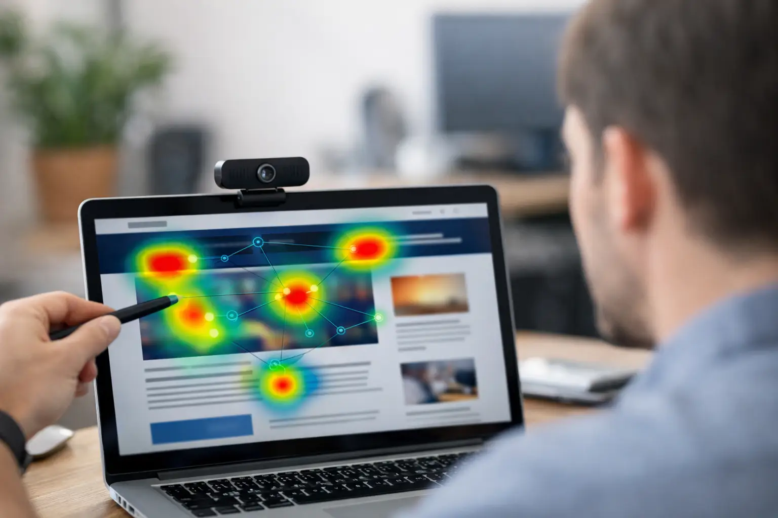
A homepage can look clear to the team that designed it and still send visitors in the wrong direction. The hero image gets attention while the value proposition is skipped. A promotional banner pulls focus from the primary call to action. A form looks simple, but people spend too long searching for the next field. Website attention heatmap analysis makes those moments visible before they become expensive assumptions.
For UX, conversion, and insights teams, the goal is not to create a colorful visual. It is to understand whether the page directs attention to the content that supports a visitor's decision. Eye-tracking data helps answer that question with behavioral evidence: what people saw, how quickly they saw it, and what competed for their attention.
What website attention heatmap analysis actually shows
An attention heatmap combines gaze data from multiple participants and displays the areas that received the most visual attention. Warmer areas generally represent more or longer fixations, while cooler or uncolored areas received less attention. On a website, this can reveal whether users notice a headline, product benefit, price, navigation element, trust signal, or call to action.
The distinction between attention and interaction matters. Click maps show where people clicked. Scroll maps show how far they traveled. Session recordings show a sequence of actions. An eye-tracking heatmap shows where people looked, including elements they noticed but never selected. That difference is often where the most useful findings appear.
A user may look repeatedly at shipping information but abandon without clicking. They may scan a pricing table yet miss the detail that differentiates plans. Or they may click a button only after spending several seconds looking at unrelated imagery. Click data alone can suggest engagement. Attention data can show confusion, hesitation, or a competing visual hierarchy.
Heatmaps are most valuable when they are tied to a specific research question. “What gets attention?” is too broad. A better question is: “Do first-time visitors notice the free trial message before they inspect the navigation?” Another is: “Can shoppers find the size guide without interrupting their product evaluation?” Clear questions make the output easier to interpret and act on.
Start with the page decision, not the heatmap
The strongest studies begin with a decision the team needs to make. This may be selecting between two hero concepts, improving a signup flow, validating a new navigation structure, or determining whether an ad landing page supports the campaign message.
Define the priority elements before participants enter the study. These are often called areas of interest, or AOIs. An AOI can be a headline, a product image, a price block, an offer badge, a navigation item, or a CTA. Once defined, they allow teams to move beyond a visual impression and compare measurable attention patterns.
Useful measures include time to first fixation, which indicates how quickly an element is noticed; fixation count, which can indicate repeated inspection; and total fixation duration, which shows how long people looked at an area. No metric has a universal “good” score. A legal disclosure may need to be seen, but should not dominate attention. A primary CTA should be found quickly, while a complex comparison table may reasonably require longer viewing time.
The question is whether the pattern supports the task. If users are evaluating a product, longer attention to specifications can be productive. If they are trying to complete a basic registration form, long attention around labels and error messages may signal friction.
A practical workflow for analyzing attention
Test the experience people will actually use
Whenever possible, test a live or realistic version of the site rather than a static screenshot. A static design is useful for early creative evaluation, but it cannot capture the effect of scrolling, expanding menus, hover states, page load behavior, or interaction paths. A live website study shows attention in context.
Keep the device scenario realistic as well. Desktop findings should not be generalized to mobile, and mobile behavior should not be treated as a smaller version of desktop behavior. Screen size, layout, touch behavior, and content order can change what participants see first and what they miss.
Recruit the people whose attention matters
A heatmap built from the wrong audience can be visually convincing and strategically misleading. Recruit participants who resemble the intended visitor in relevant ways: market, device use, familiarity with the category, customer status, or purchase intent.
For exploratory UX work, a smaller focused sample can identify obvious attention barriers. For comparative decisions, segmentation, or stakeholder-facing validation, a larger sample offers more confidence. The right sample size depends on variation in the audience and the precision required, not on a single fixed rule.
Give participants a natural task
Attention without context is difficult to interpret. A participant asked to “look at this page” may scan very differently from someone asked to compare plans, find a return policy, choose a product, or decide whether to request a demo.
Use a task that reflects the moment you want to understand. Then separate task-driven viewing from more spontaneous first impressions when both matter. A five-second exposure can help assess immediate message visibility; a longer task can reveal whether the page supports exploration and decision-making.
Check data quality before reading patterns
Remote webcam-based eye tracking makes attention research faster and more accessible, but quality controls still matter. Participants need adequate lighting, a stable camera position, and successful calibration. Review tracking quality and exclude recordings that do not meet the study standard.
Do not treat a dense red area as proof by itself. Heatmaps aggregate behavior, and aggregation can hide important variation. Pair the heatmap with individual gaze replays or fixation plots when a finding seems surprising. This helps distinguish a consistent pattern from a result driven by a few participants.
Compare the evidence against the intended hierarchy
Review the page from top to bottom and ask practical questions. Is the primary message seen before secondary navigation? Does visual attention move from headline to supporting copy to CTA? Are users drawn to decorative elements that do not help them complete the task? Does an important element appear below the natural attention path?
An AOI comparison is especially useful when evaluating alternatives. If Version A gets faster attention to the main benefit but Version B creates more attention on the CTA, the team has a meaningful trade-off to investigate. Survey responses, task success, and conversion data can then clarify which pattern leads to better outcomes.
How to avoid common interpretation mistakes
The first mistake is assuming that more attention always means better performance. A warning, error state, confusing label, or unexpected price can attract substantial gaze. Attention indicates noticeability, not approval or comprehension. Pair eye-tracking with survey questions, usability observations, or task outcomes to understand why people looked.
The second is mistaking blank areas for irrelevant content. A low-attention area may be below the fold, outside the participant's task path, or simply too small in the heatmap scale to stand out. Review scroll behavior and the exposure time before deciding that the content was ignored.
The third is treating desktop and mobile results as interchangeable. On mobile, users often see one content block at a time, while desktop layouts create simultaneous competition among navigation, imagery, copy, and side content. Analyze each experience independently before making design changes.
Finally, avoid redesigning everything after one study. Focus on the clearest mismatch between intended and observed attention. A small change to headline placement, visual contrast, CTA wording, content order, or image choice can produce a more informative next test than a complete redesign.
Turn findings into changes teams can defend
The practical output of website attention heatmap analysis is a prioritized set of design decisions. Frame each finding as an observed behavior, a likely implication, and a testable action. For example: participants looked at the product image before the benefit statement, so the page may be delaying comprehension; test a revised layout that brings the benefit closer to the initial gaze path.
This format helps researchers communicate with designers, marketers, and product owners without overstating certainty. It also creates a clean path to iteration. After updating the page, repeat the study with the same audience and task where possible. Compare attention to the priority AOIs, then evaluate whether the change improved task completion, preference, or conversion behavior.
RealEye supports this workflow in a browser-based environment, combining webcam eye tracking with surveys, mouse tracking, live website testing, attention visualizations, and exportable data. That makes it possible to move from a research question to a practical page decision without the overhead of a traditional in-person eye-tracking lab.
The next time a stakeholder says a page “feels right,” turn that instinct into a question participants can answer with their behavior. The most useful page improvements often begin with a simple discovery: visitors are looking exactly where the team did not expect.